ESRI User Conference Session Notes
In the week of July 11-15 2022, I attended ESRI User Conference in San Diego, CA. I had a blast attending sessions, talking to ESRI staff at the Expo, and visiting the map gallery. It was an abundant learning experience as I was able to take notes, learn new things, and get inspired on how emerging GIS technologies can assist and advance our transit planning projects. My participation was supported by my company and I am planning to host a presentation to share what I’ve learned at this exciting event.
This article is a collection of notes from a series of interesting sessions I participated. Most of the sessions were held by ESRI employees, and a few by other organizations. In each chapter I will include a link to the source or to a website with more information. In each chapter, the image(s) is from the source link as well.
1. Innovative Use of Transit Data
North Carolina DOT and North Carolina State University designed an online hub that uses historic demand response transportation data to guide their decisions on future service. Please see the image below for the functionalities of this Hub. According to the presenters, the following processes are automated: collect and update demand response records; GIS processing; online Hub updating. These are the tools they used for deploying this app:
- GIS analysis using Python scripts within ArcGIS Desktop, use ArcGIS Enterprise (Portal, Server, Web Adaptor)
- PostGIS spatial database Extender (PostgreSQL database)
- Customized WebApp using WebAppBuilder Developer Edition (combined 2 themes together)
- Deployed on AWS (EC2 instance) using Cloud Formation Template
- Web GIS Application is hosted on AWS
Unfortunately this tool is not available to the public. There is an article about this application.

2. Emerging hot spot analysis
ArcGIS Pro now has the function to calculate hot spots by looking at two dimensions: time and location. By treating time and location as two sides of a cube, this tool calculates the value of each cell by comparing it to its neighbors in three dimensions (both in time and location).
The output of this tool shows the emerging hot spot or cold spot of data, for example, emerging Covid cases in the US. The tool can also identify consecutive hot spots, or places with significant high increase rates of value within a certain time frame.
The input of this tool is netCDF, which is the output from other GIS tools that contains field value, location, and time.

3. Spatial Statistic Prediction Models Brief Introduction
- Exploratory Regression
ArcGIS takes all the combinations of independent variables and runs OLS on each combination. Then, the tool automatically finds statistically good combinations and runs spatial autocorrelation tools on these variables. This step further validates the model. User needs to set the minimum and maximum number of independent variables.
- Forest-based classification and regression
This tool uses the random forest machine learning model, runs predictions on multiple iterations of categorical selections. Different category selection order can lead to different results.
4. Data Engineering Tools
Data engineering tools allow users to manipulate attribute tables in more interactive and convenient ways. A few examples:
- Fill missing values tool will identify features with missing value, and fill the value with the average of its neighbors. When using this tool, ArcGIS Pro will highlight features with null value on the map. This could be very convenient.
- For numeric fields, you can use data engineering panels to see the distribution and basic statistics of the fields.
- For categorical fields, you can right click to create bar charts, and the charts can be shown on the map. Selecting bars on the bar chart will select features on the map. Therefore, this is actually an ArcGIS Pro built in dashboard for interactive data review and manipulation.
- Please note that filtering must be done by selecting and exporting to a new layer. This cannot be done in data engineering.

5. Integration of ArcGIS Pro and Coding Languages
If you’re an R user, you can link and open GIS layers in RStudio using the R Arcgis Bridge library. This has been covered by a previous R Training Session.
If you’re a Python User, you can use Notebooks in ArcGIS Pro. ArcGIS Pro Notebooks application allows users to use Jupyter Notebook that is built in ArcGIS Pro, to create and share documents that contain live Python code for geoprocessing, visualizations, and narrative text. A tutorial session can be found here:
6. ArcGIS for Sharepoint
You can create an ArcGIS Online Map within Sharepoint website, showing point-based data on the map. The data source can be an Excel table with lat and long information. The online map has similar configurations as ArcGIS Online Maps. You cannot open this Sharepoint map on ArcGIS Online. However, ArcGIS for Sharepoint has the following advantages:
- Conveniently share the map publicly, or within the organization using Sharepoint user accounts.
- Link a Sharepoint document to each point. For example, attach a PDF to a point. This is called Geotag.
- Calculate walkshed/driving buffer on Sharepoint. Whether this consumes credits or not is unknown yet. User discretion advised.
- Microsoft Teams also has an ArcGIS Maps add-in App.
- You can plot lat and long tables on a map in Excel as well, but this effort requires enabling Excel Add-ins, which you would need an application through IT.

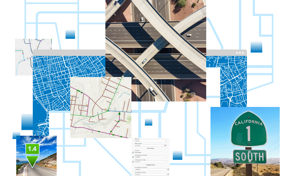
7. ArcGIS Roads and Highways and Linear Referencing System
ArcGIS Roads and Highways is an ESRI product that allows users to manage, import, draw, and reference roadway data using a unified linear referencing system and measuring units. This product is built into ArcGIS Pro or ArcGIS Online, and could be potentially useful when creating new transit routes, roadway design, city and streets projects, especially for a large geographic area.
8. StreetMap Premium
Too busy to set up your own street network for routing and walkshed analysis? ESRI now has StreetMap Premium, which allows users to run Network Analyst functions without building anything. And of course, this costs credits. The advantages of this service are:
- They use reliable network database HERE;
- User has the option to add their own network datasets, like modified GTFS, user-defined road work information, etc;
- The availability to use the service offline during field work.

9. Style Viewer
You create a beautiful map with user-defined symbologies, but exporting to ArcGIS Online, the beautiful symbologies are reverted to basic symbology. What a shame! Now, with Symbol Styler, you can preserve your symbology (to some extent), just with a few extra steps. First, you need to share your symbology settings as a web style, in svg format. You can then find your symbol styles on your enterprise portal or ArcGIS Online contents. Then, on ArcGIS Online Map editing page, you can select user defined styles. On the contrary, you can download an existing web style to ArcGIS Pro, to use other people’s symbology.

10. Power BI symbology
ArcGIS Module for Power BI now supports more symbologies, similar to ArcGIS Online maps. You can create heat maps, ESRI collection icon maps, size and color maps, etc.

11. Export to AI
Exporting maps to AIX from ArcGIS Pro is covered by previous GIS Hangouts. Additionally, ArcGIS Enterprise users can save multiple portal URLs in Maps for Adobe Creative Cloud, and users can switch between Portals within Adobe Creative Cloud platform easily. This applies when the user is connected to both the NN portal, and the client’s portal.
You can set up a “blend mode” for a specific layer in ArcGIS Pro, for example, the hillshade. This blending mode will be preserved in the AIX file, creating a nice-looking shaded map.

