Tableau Show Average Line on Percentage of Total Bar Charts
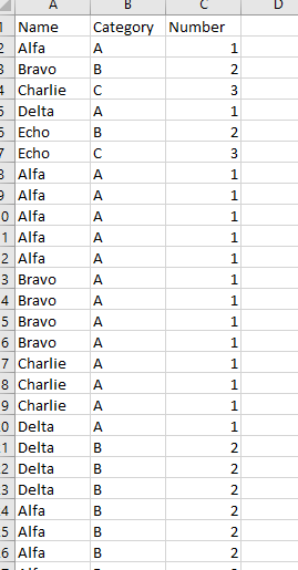
In Tableau, you can show categorical records as percentage of total bar charts. For example, you have a data table like this:
You’re interested in the percentage of total for A, B, and C distribution for each name. To do this, you can do this by putting “Name” on Columns, and “Category” on Rows, and change the “Category” to Measure(Count), Quick Table Calculation to Percent of Total, and Compute Using “Category”. Drag “Category” to color, and you can get a chart like this:
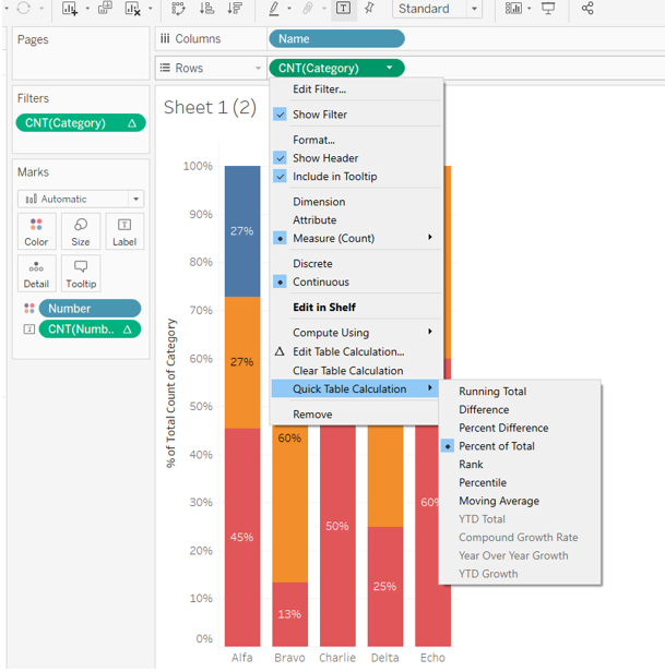
What if you’re interested in the average percentage of total for Category A? If you drag the Average Line for “Category” to the chart, the average line will show up as 100%.
In order to show the average percentage of total line, you can do the following:
First, change the “Category” data order and put “A” at the bottom.
Create a calculated field “A Percentage” as SUM(IF [Category]=“A” THEN 1 ELSE 0 END)/COUNT([Number of Records])

Drag “A Percentage” to Rows, and remove the color card.

Then, set Dual Axis for the two Rows items, and switch back the chart type to bar charts.
Drag the Average Line from Analytics to AGG(A Percentage).

Right click on one of the Y axis, and click on Synchronize Axis.

Drag the “A Percentage” to the left of “Category”, or set the color of “A Percentage” to transparent. Tada, there you have a bar chart with the average line for percentage of total for Category A!
